Age of Empires: Castle Siege
Castle Siege brought Age of Empires to the iPad, in the spirit of Clash of Clans. The series had only ever been on PC, and it was one of my favorite games growing up.
I was the only UI/UX designer on the team, so I owned all of it: the research, adapting the framework for touch, the flows, and the art style. Much of the framework came from existing patterns in the Age games and Clash of Clans; my job was simplifying the Age flow for quick touch play, and giving it an art style that felt like Age of Empires rather than every other iPad game.
- Role
- Sole UI/UX designer
- Services
- UX designUI designArt direction
- Client
- Microsoft Game Studios
- Team
- 22–25 people
- Platform
- iPad
- Year
- 2013
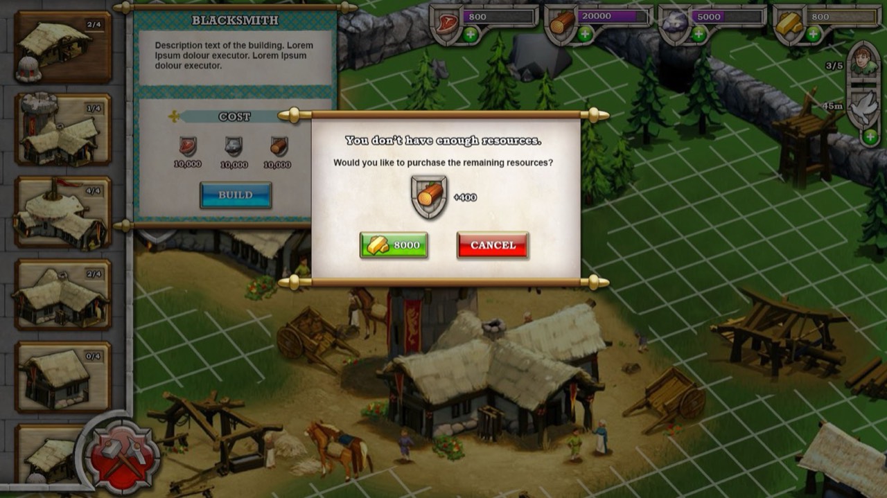
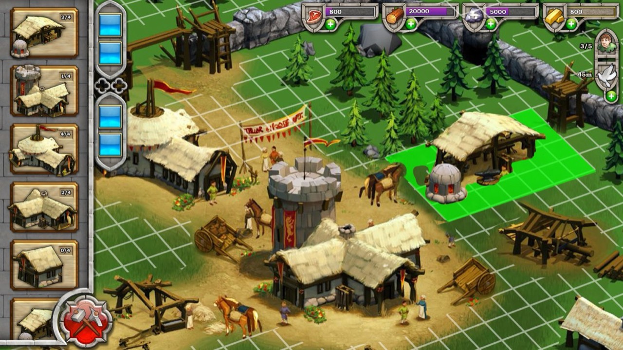
Build mode
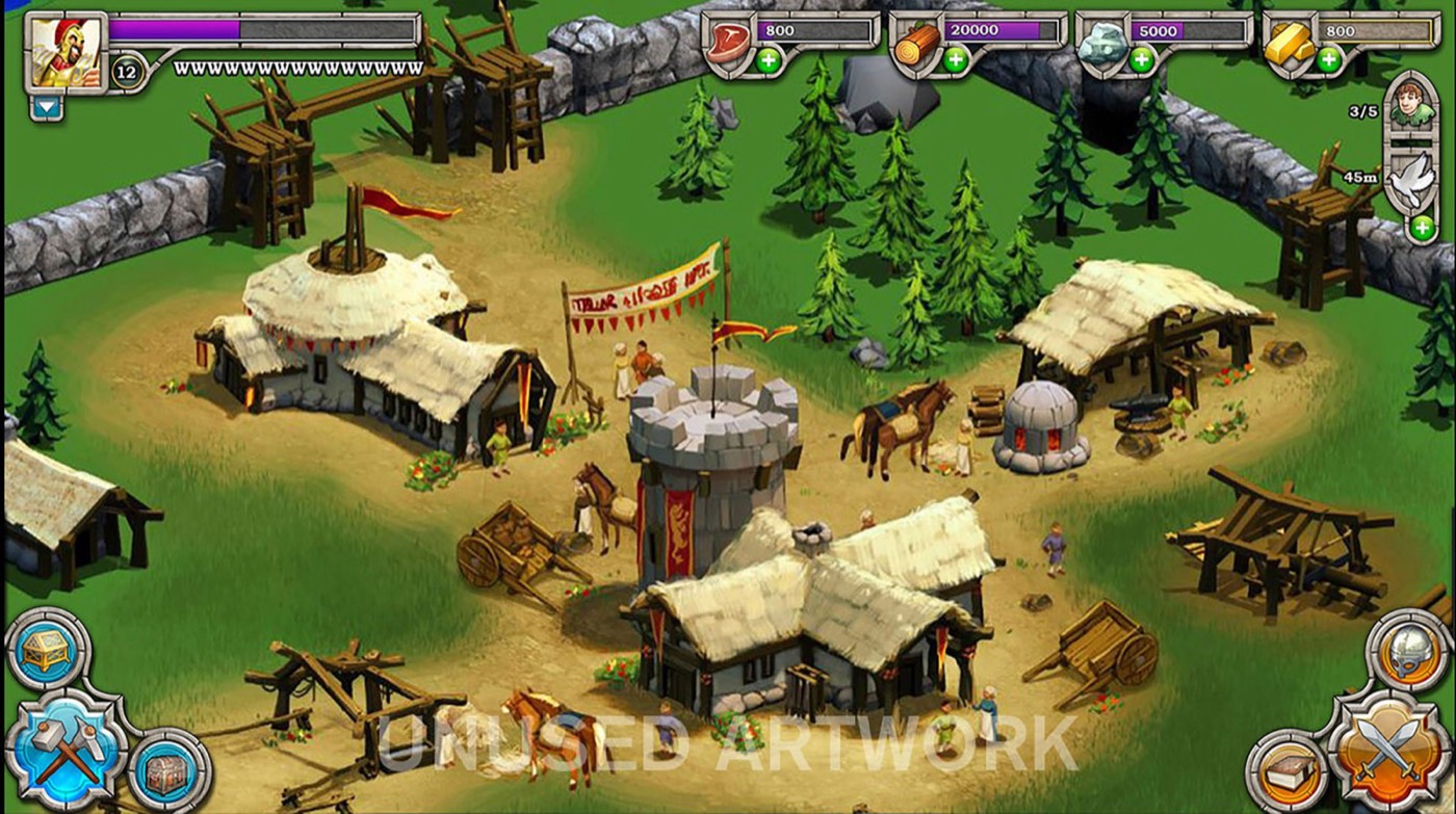
Building and attacking became separate modes so players could focus on one at a time. Build mode went through many rounds to feel fast on a touch screen, keeping actions close to where your hands rest on an iPad.
- First run
- Building is central to Age of Empires, so the first pass set the framework and flow for how players build their empire: easy to touch, and simple.
- After testing
- Playtests showed that on an iPad your hands rest on the sides, so I kept the building actions close to them to cut down hand movement.
- Final
- More iterations made building feel fluid and fast on touch, while still feeling like the PC games.
Economy
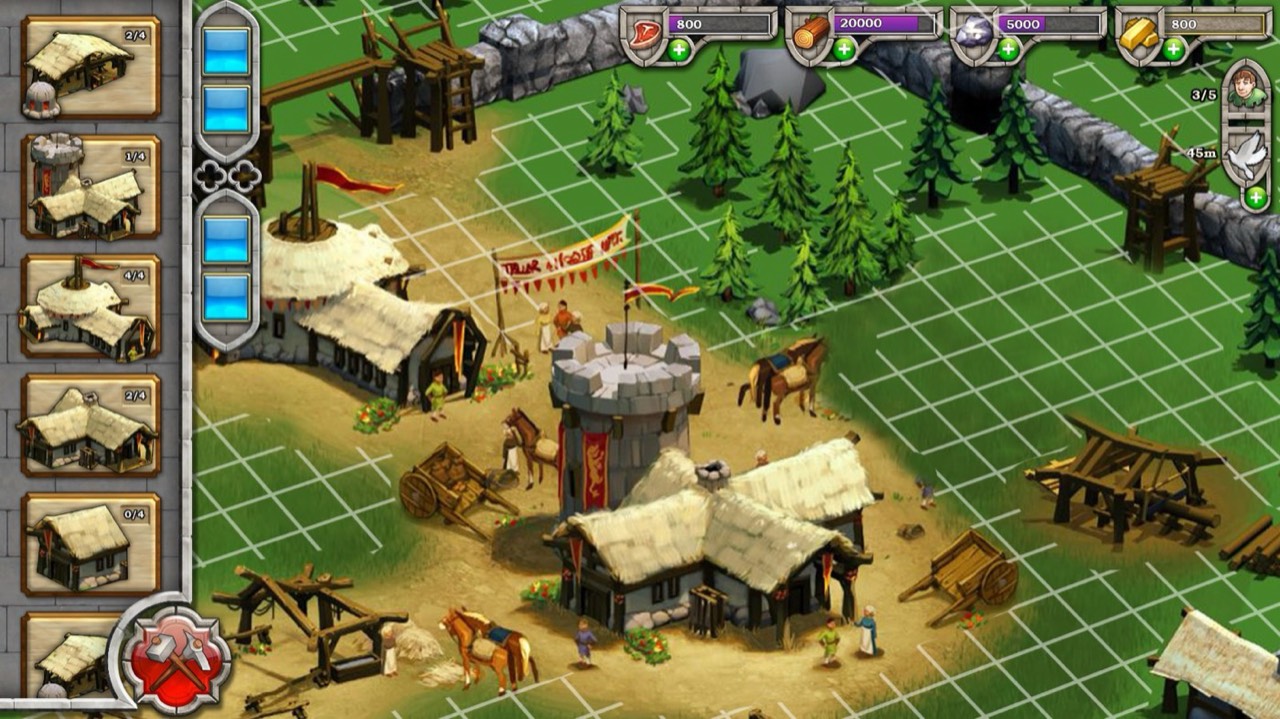
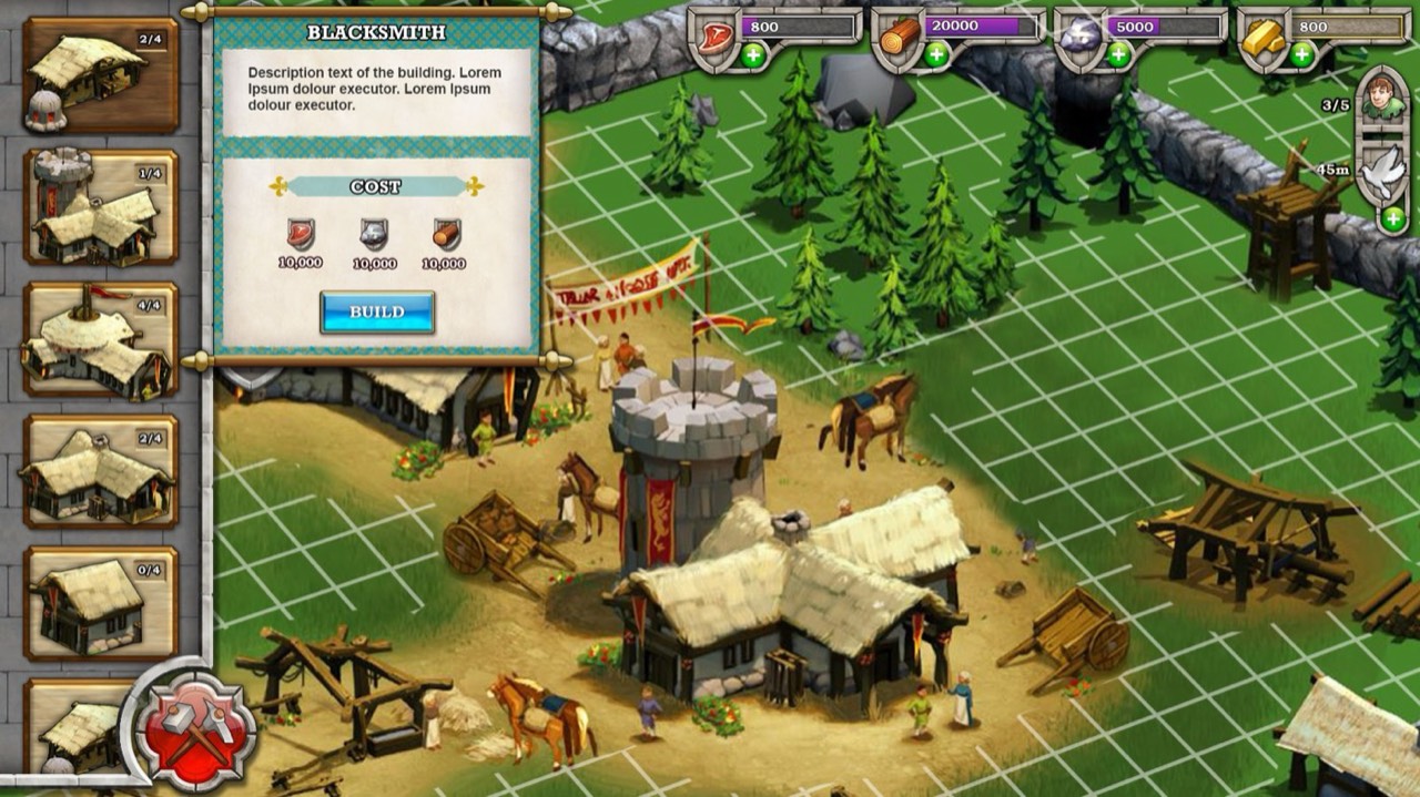
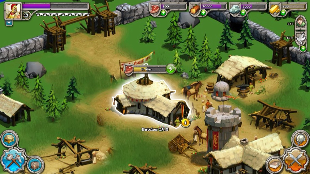
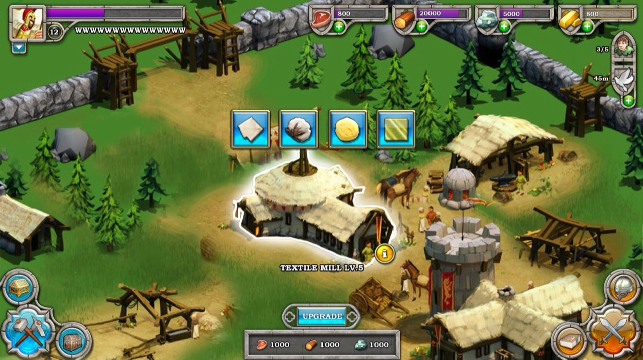
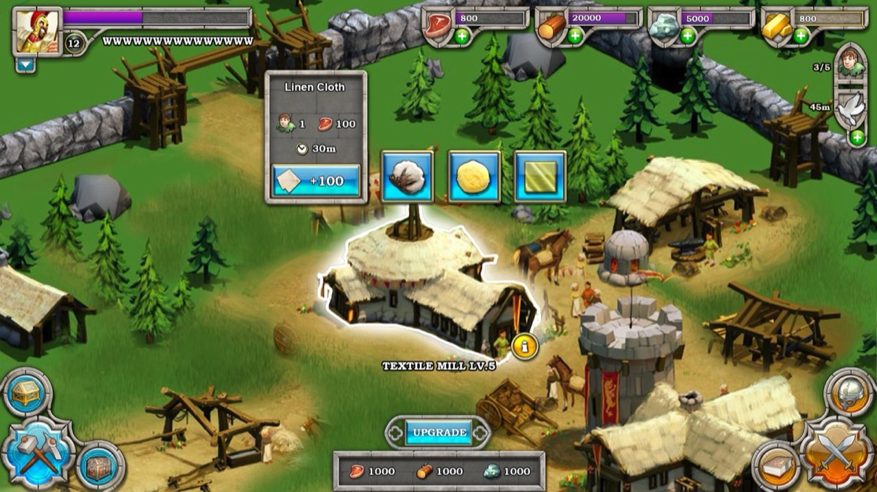
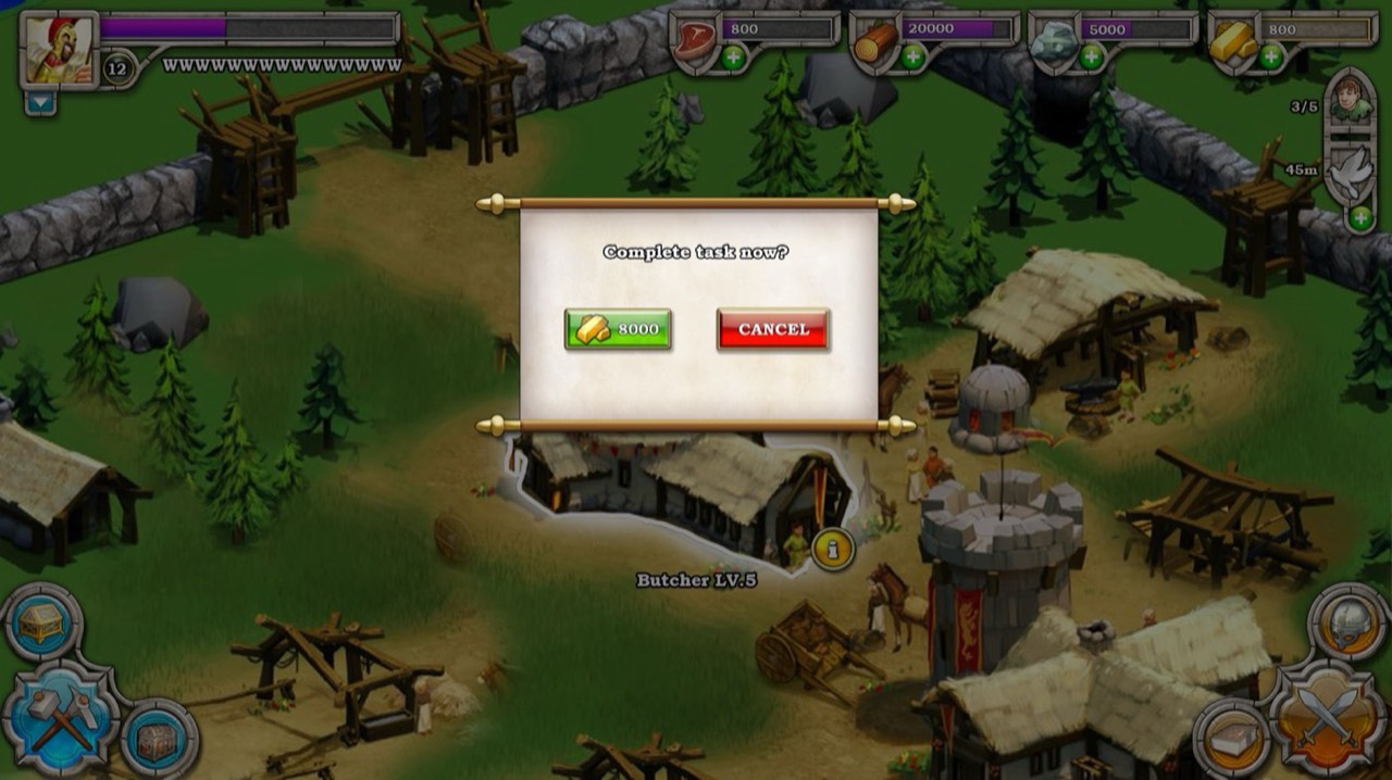
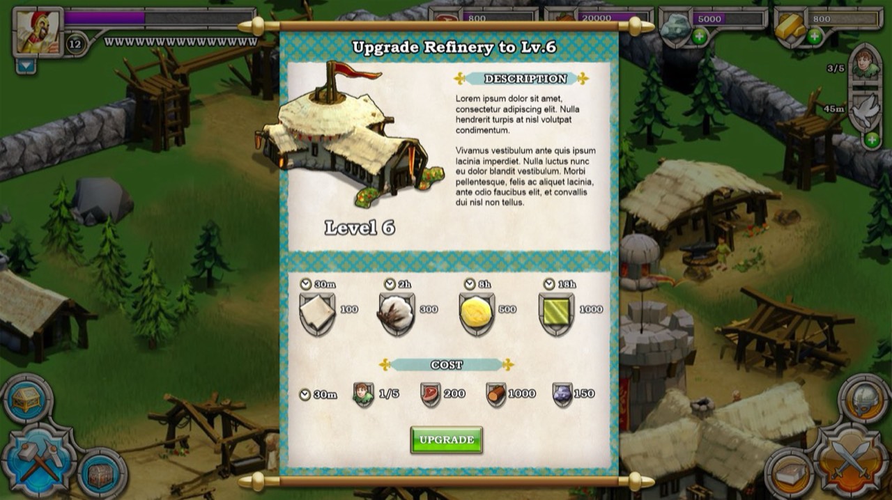
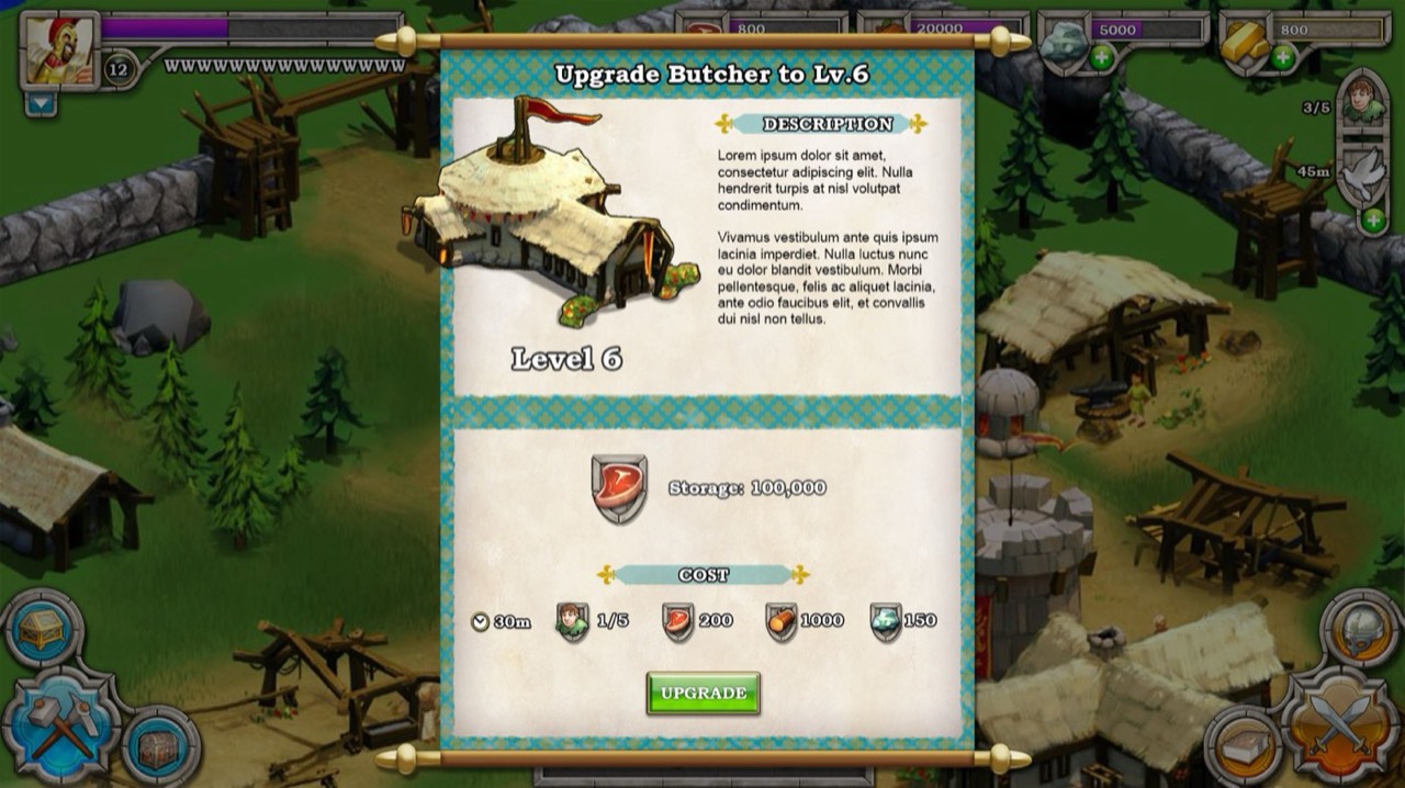
RTS games are all about maximizing your resources, so the economy needed a system built for touch.
- First run
- The flow followed existing patterns from the Age games and Clash of Clans. The challenge was showing it simply.
- Honing the flow
- I cut the visual information down as far as I could, so players weren't overwhelmed and could manage resources with fast touches.
- Final
- With the framework settled, I applied the art style I had established for the UI.
Army
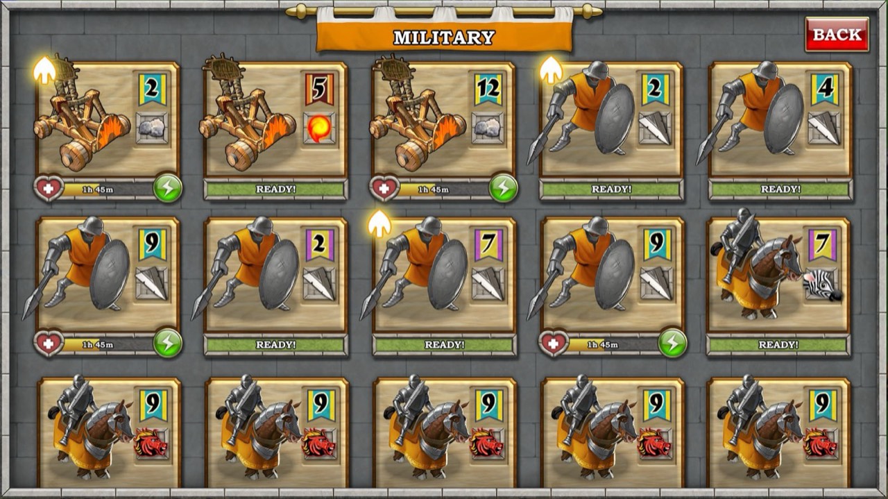
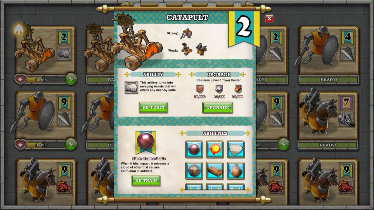
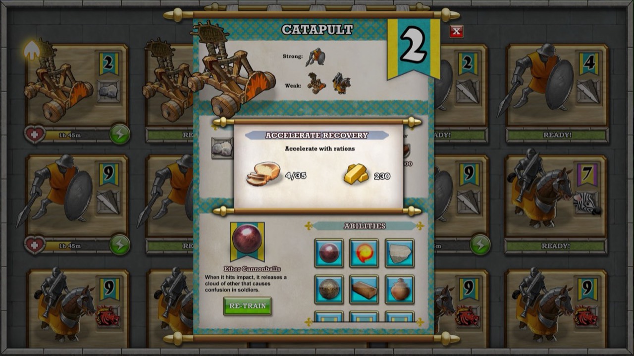
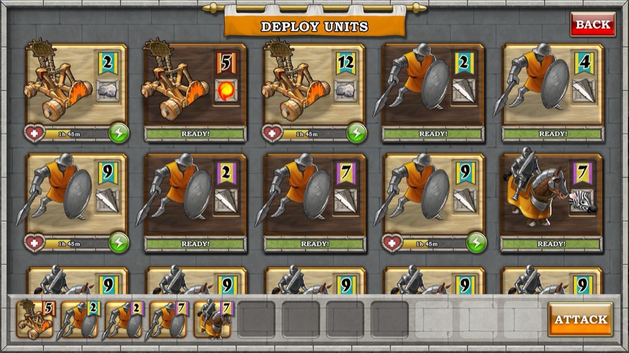
Everything you build leads up to the fight, so attack mode got its own focused space.
Art style
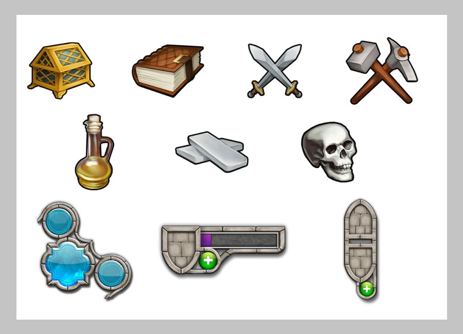
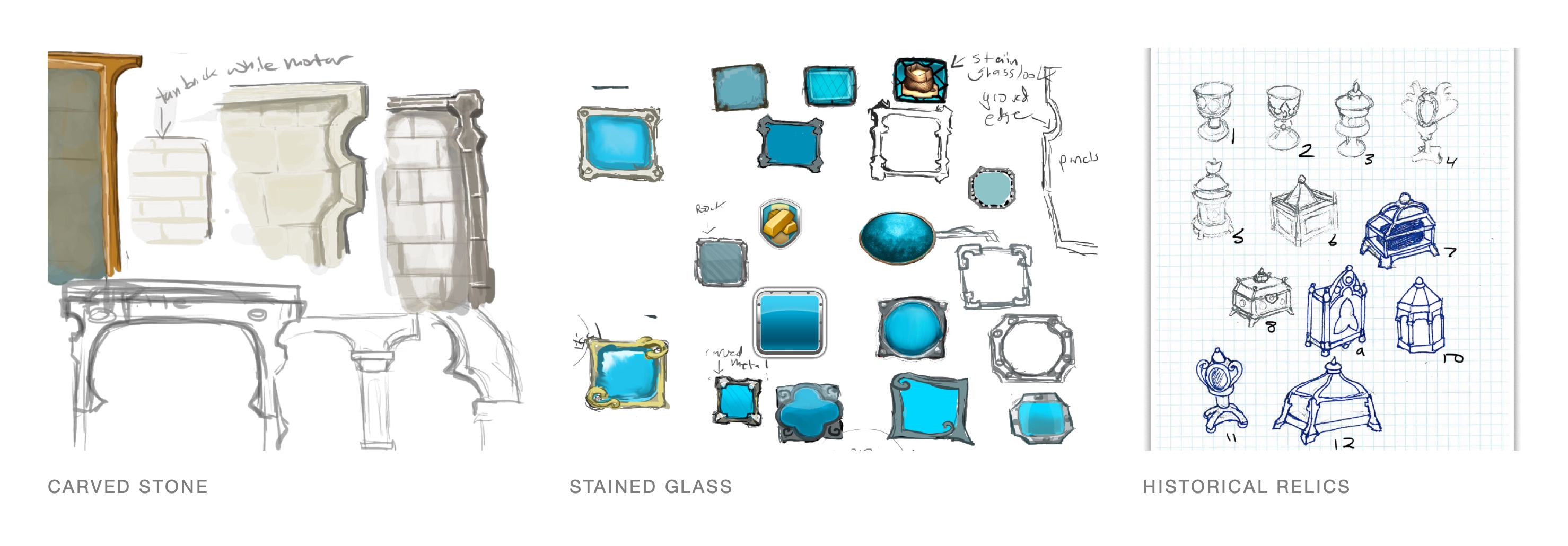
I wanted the interface to feel like part of Age of Empires rather than every other iPad game, so I started with history: carved stone, since so much of the game is about building; stained glass, to give buttons their own flair; and historical relics with religious or mystical meaning for the special artifacts.
The final elements feel like an iPad game and like Age of Empires. I also proposed that the interface change as you age up into later centuries.