Game of Thrones Exhibits
A proof of concept to show HBO's board that interactive experiences were a real new way to tell a show's story, one any show or new showrunner could use. We used Game of Thrones to prove it.
I was the only designer on HBO's 14-person research and development team, and owned the whole design experience. We chose Game of Thrones, HBO's biggest show and then in its fourth season, and set out to make the most complete companion to it: its families, costumes, sets, languages and history.
- Role
- Lead designer
- Services
- UI/UX designInteractive design
- Client
- HBO
- Team
- 14 people
- Year
- 2014
The vision
My favourite project of my career, and the most intense. To make the case to HBO's board, we designed the most complete companion to the show we could imagine, starting with its traveling exhibition of costumes and props, which only a few cities ever saw. Here are the pieces, two of them as working prototypes you can try, and then how it came together.
The exhibits
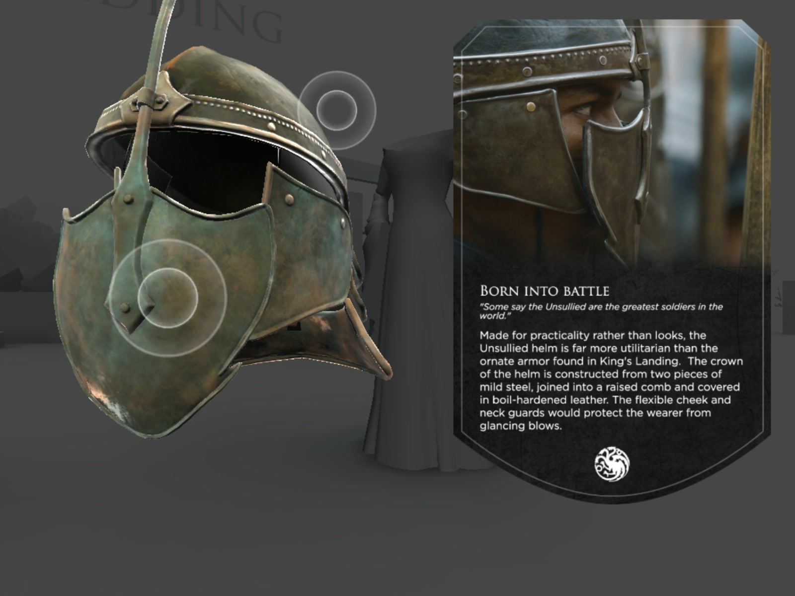
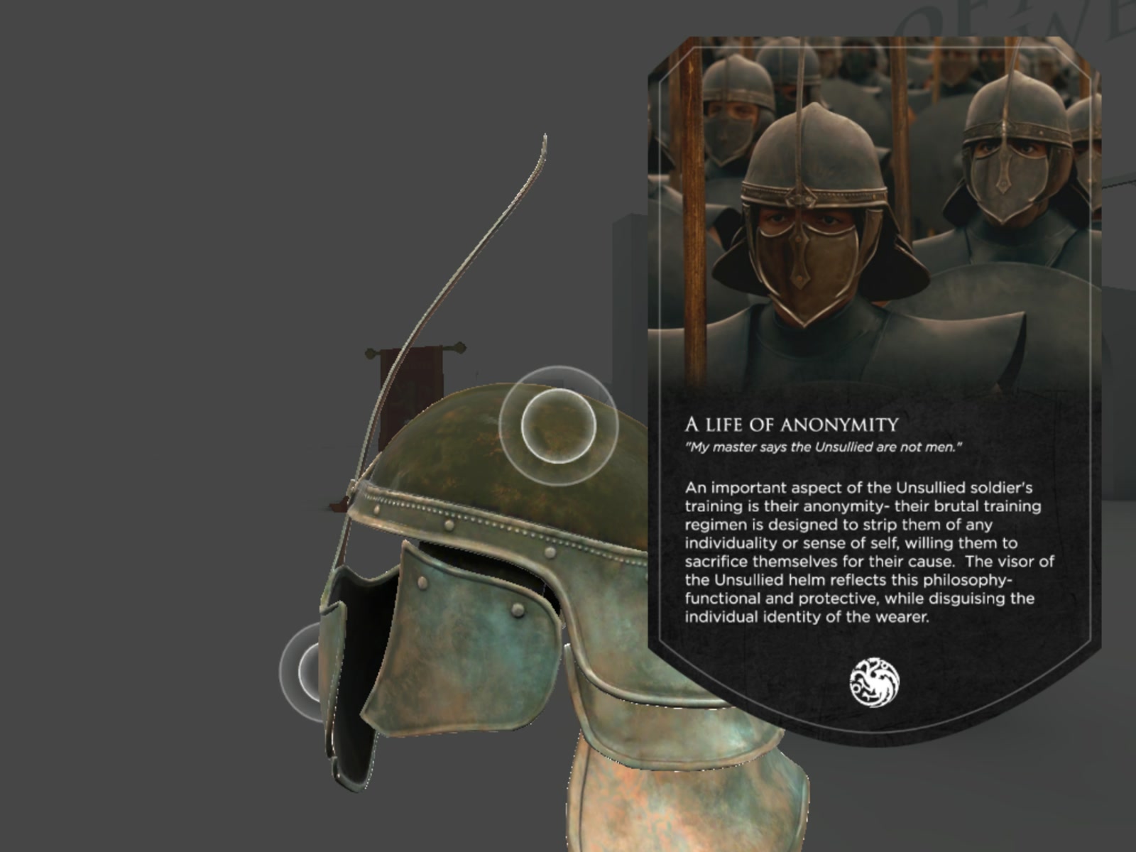
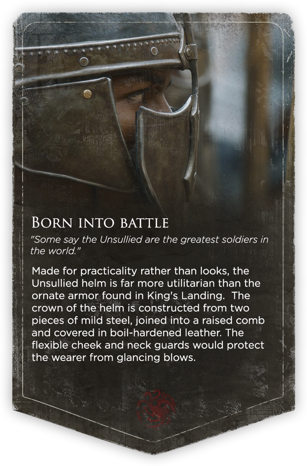
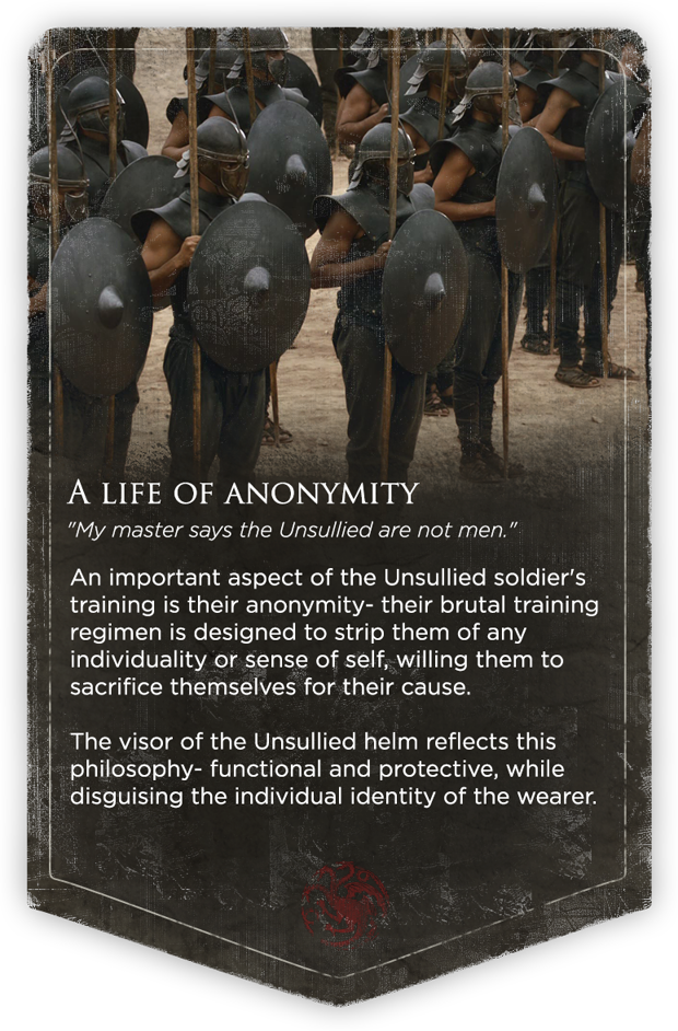
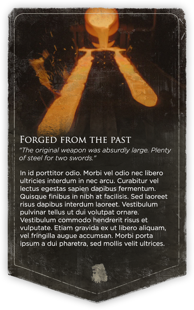
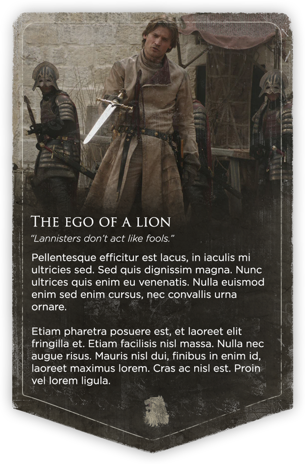
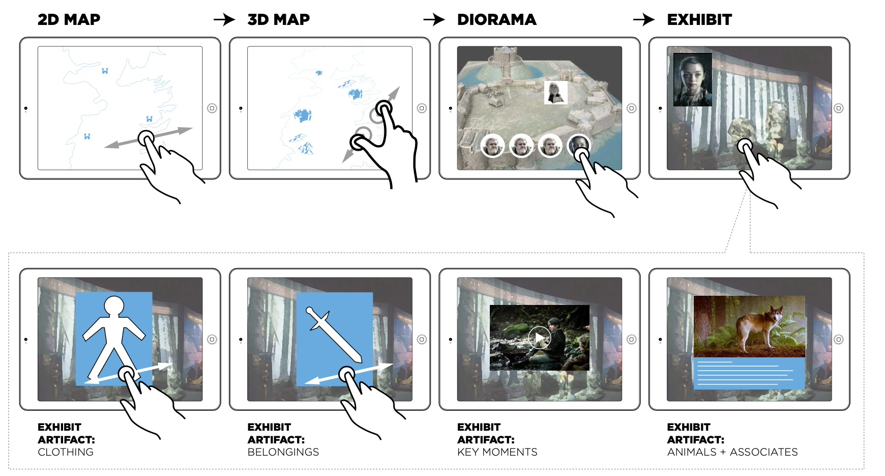
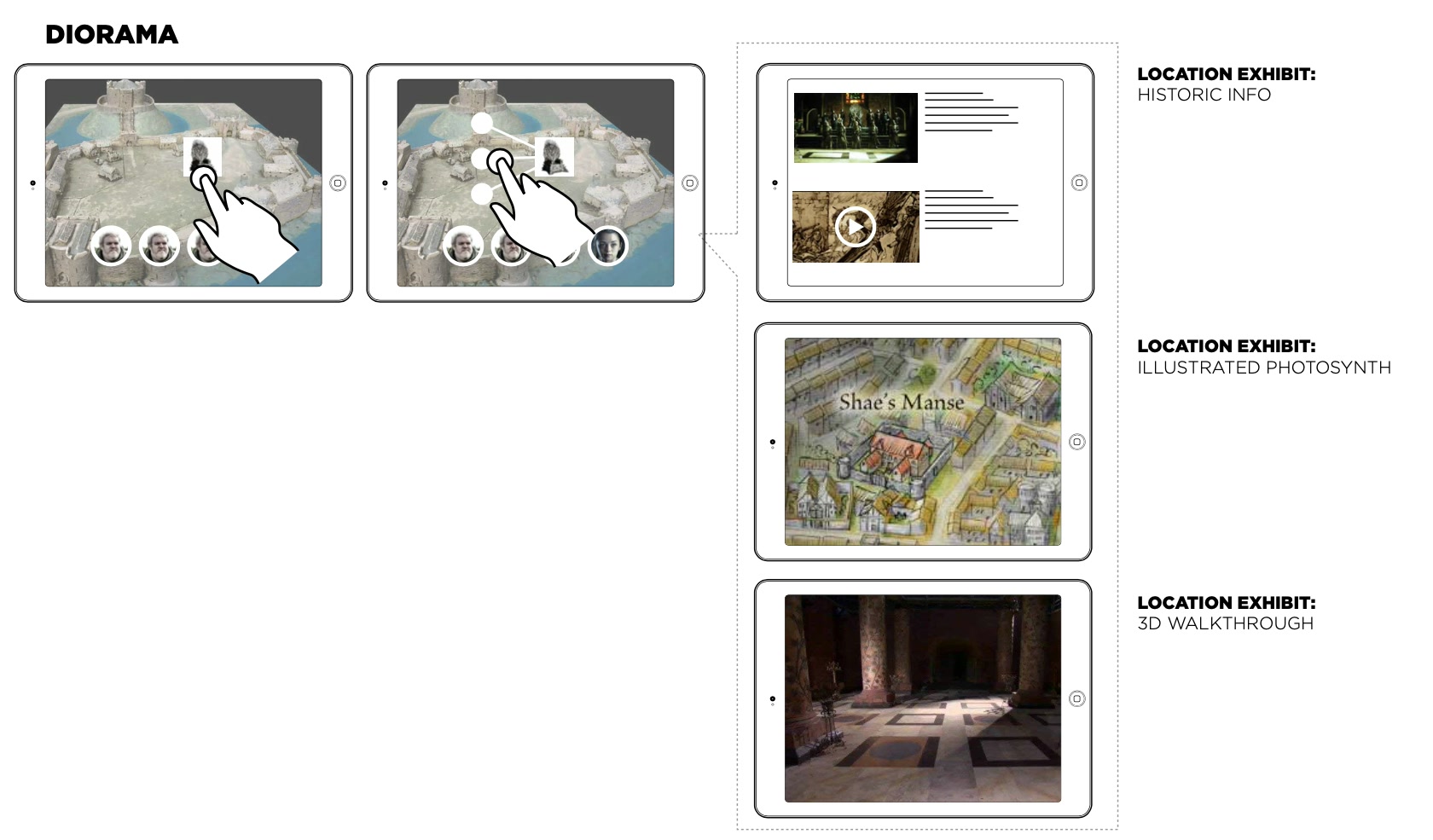
The heart of the app. With photos and 3D scans of the real pieces, each house became a guided exhibit: scenes blend into one another like walking through one space, and hotspots on each 3D object open the story behind that detail.
Each exhibit is staged like a theatre set or a shop window. In this motion test, I explored how to move from one scene to the next and how the objects live within that space: scenes overlap, so each one blends into the next.
The interactive map
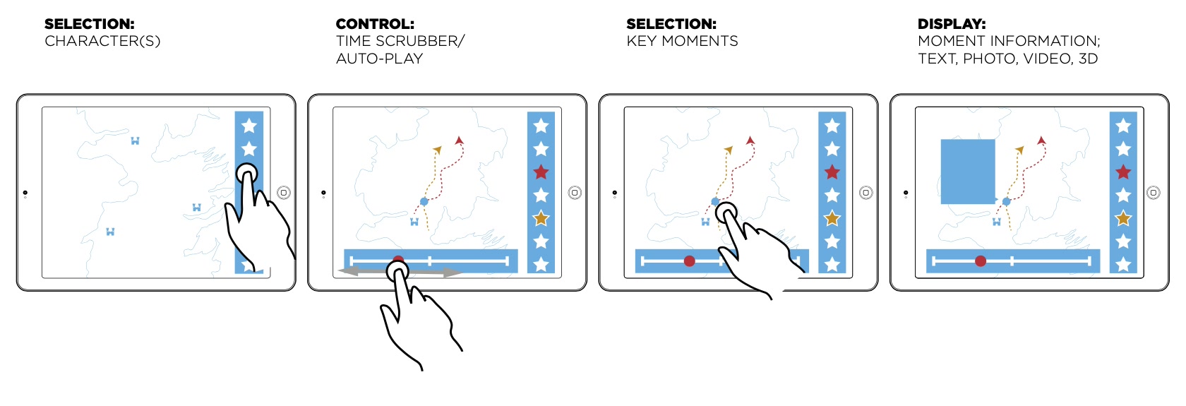
Characters travel huge distances over the story. The map lets you follow anyone's journey across Westeros and beyond, season by season, with the key moments marked where they happened, and see where the armies marched.
- Follow the story
- Select one or more characters, then move through the episodes to see where each of them goes.
- Pick a house
- Each great house has a tab of its characters, plus one for key characters outside the major houses.
- Key moments
- Story moments are pinned where they happened, with a short summary.
- Armies
- A toggle shows where the armies marched and the battles they fought.
The family tree
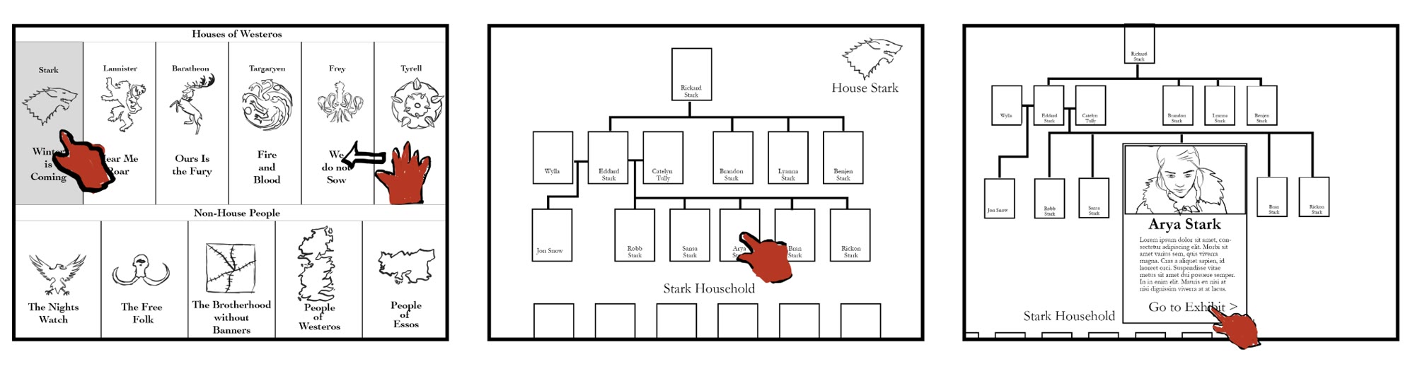
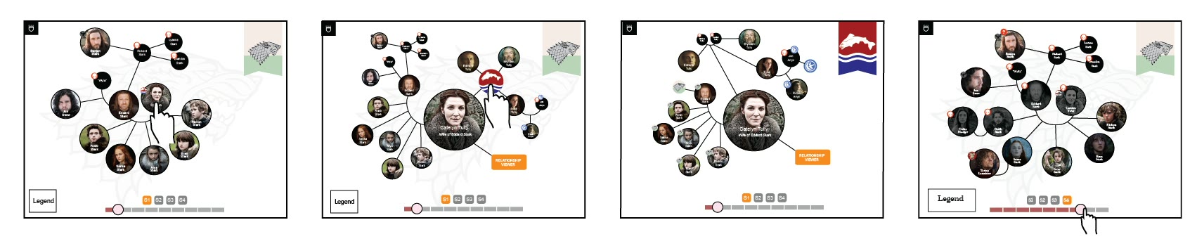
The show has hundreds of characters, and their families keep changing through marriages, deaths and revelations. The tree follows the show episode by episode.
- Follows the story
- People join, marry and die in the episode where it happens.
- Focus on one person
- Tapping someone shows only their close family.
- Houses connect
- People who married in bring their own family, with a sigil that opens that house's tree.
- Lines carry meaning
- Double lines are marriages, dashed lines are lovers, and the dead fade to grey.
Relationship Viewer
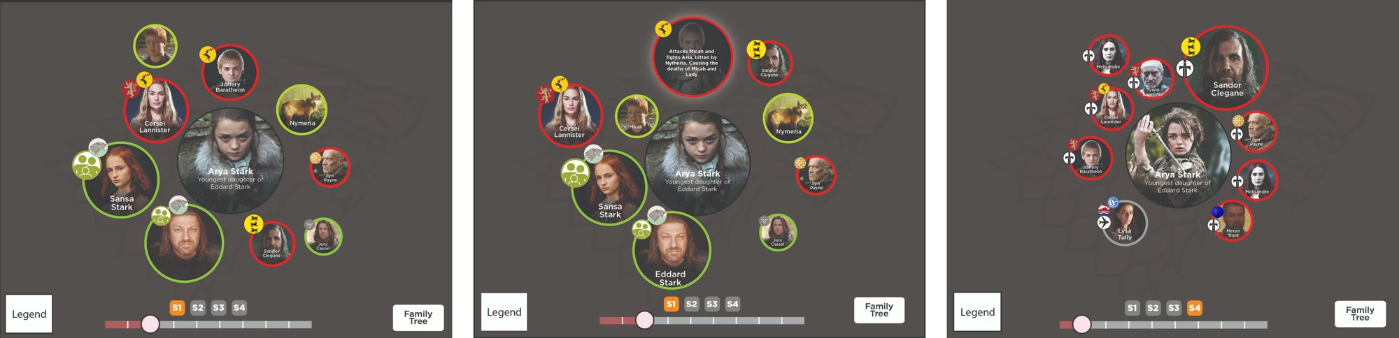
For each main character, who they dealt with in every episode, marked as family, friend or enemy.
Concepting
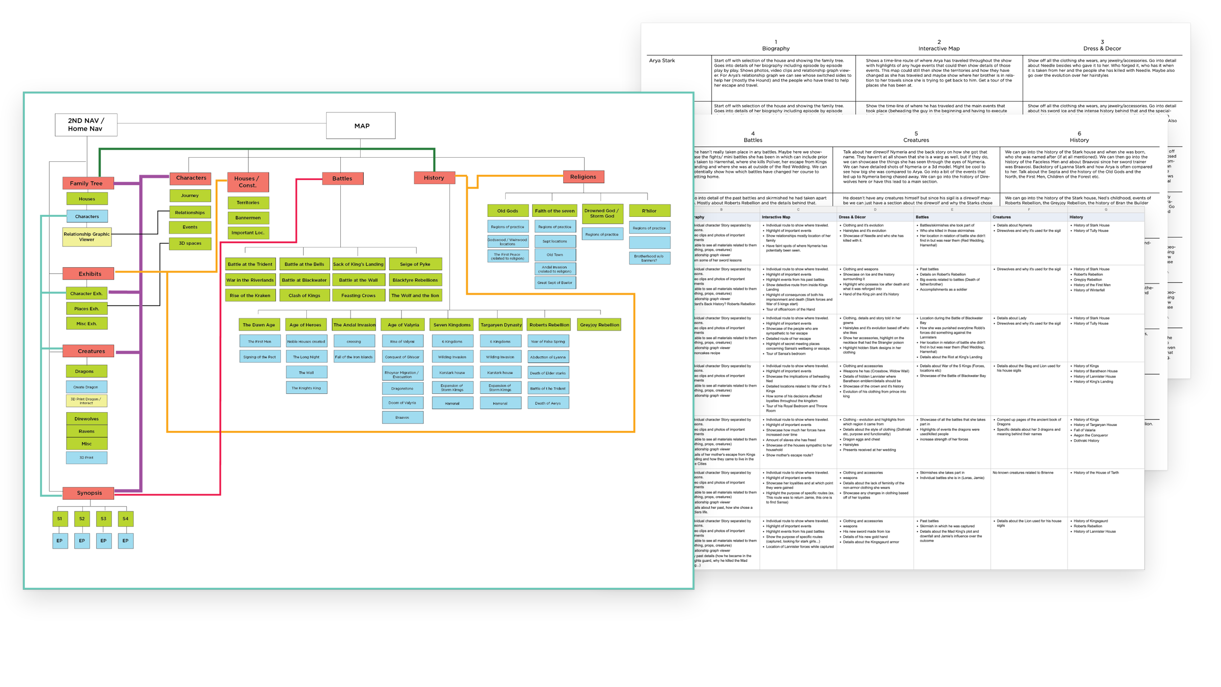
Before designing anything, I went through everything in the show so far and organized it all into categories, so we could map out the whole product story.
- The question
- Which show, what kind of experience, which platform and which story.
- The scale
- Four seasons, forty episodes, hundreds of characters, a dozen great houses, battles, religions and thousands of years of history.
- People first
- For seven main characters, I planned what each brings to every part of the app: biography, map route, clothing and props, battles, creatures and history.
- All connected
- I mapped how every area links, so a fan can start anywhere and still find everything else.
Research
The deepest research I've done in my career. I had folders upon folders: the show itself, websites, iPad apps, architecture, fashion, historical art styles, modern design, infographics, each with a deep dive into what it could bring to the app. In all, 7 research areas, 16 reference boards and 18 feature ideas.
Visual style
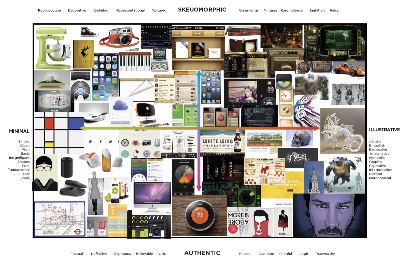
One of the most labour-intensive studies: which UI style fit best. I split it into four categories, from minimal to illustrative and from authentic to skeuomorphic, to decide how much the interface should shine and how much it should step back for the objects.
Biographies
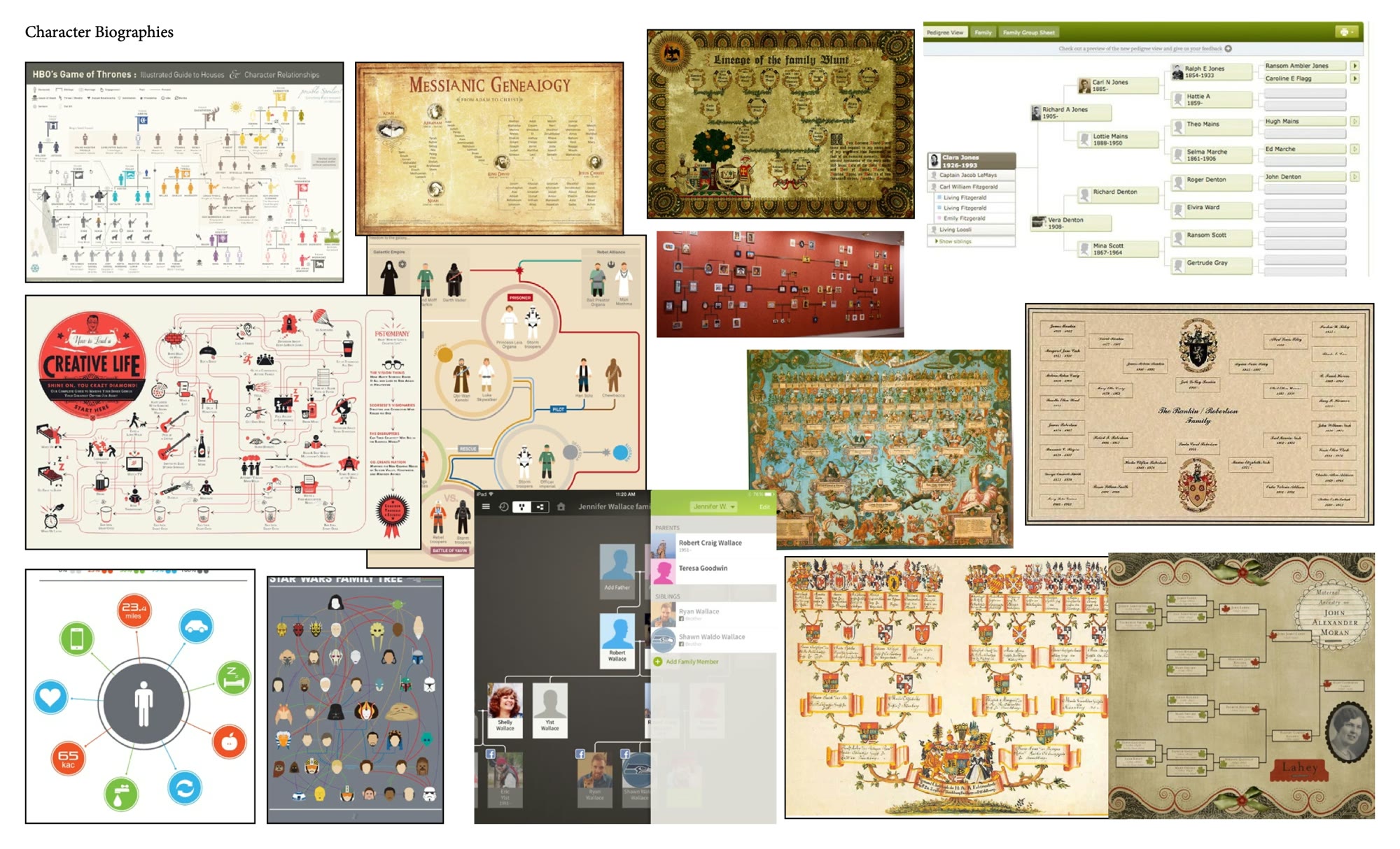
The family lineages are some of the most compelling parts of A Song of Ice and Fire, but the show can't go into them in full. An interactive family tree for each house would show the real breadth of characters.
- Select anyone to read their history
- Relationships beyond blood and marriage
- Links to the people characters were named after
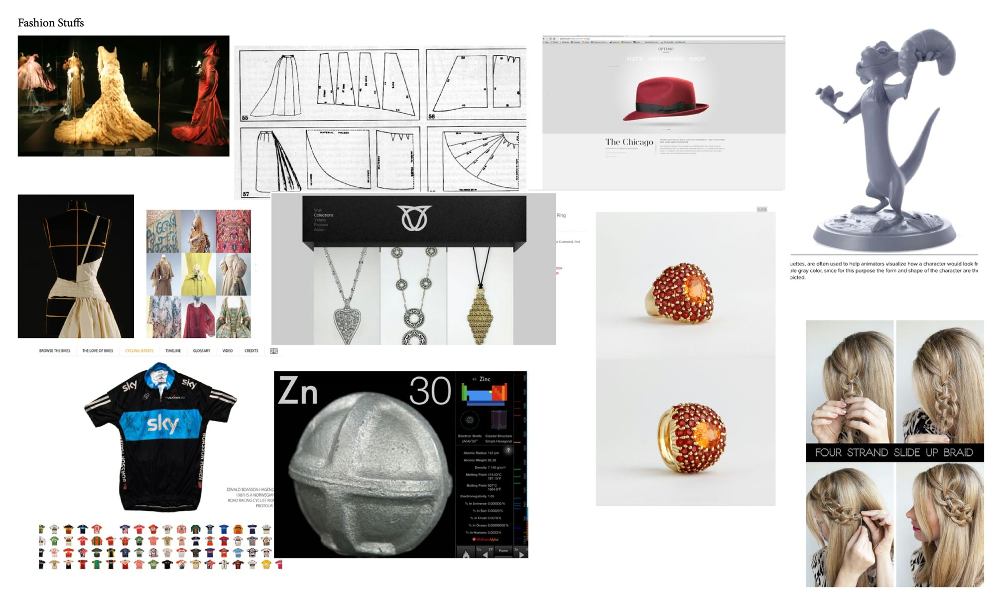
Fashion and props
We wanted 3D scans and models of the props so people could see every detail of these beautifully made pieces, recreating the traveling exhibition most fans never got to see.
- Guides to braiding your hair like characters on the show
- The stories behind the embroidery
- 3D-printing blueprints for some of the props
Dragons
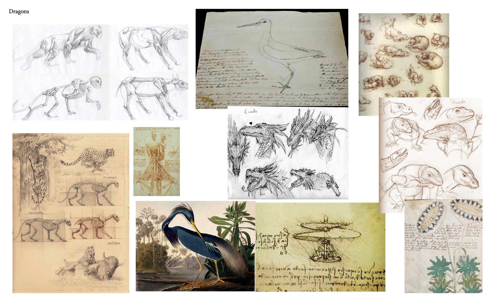
Dragons are extinct when the show begins, but they run through its history. I pictured in-depth, almost Darwin-like journals of each dragon alongside detailed 3D renders.
- A size comparison of the known dragons
- Each dragon's history and riders
- Concept art from the show
- How the Valyrians controlled dragons with blood magic
Battles
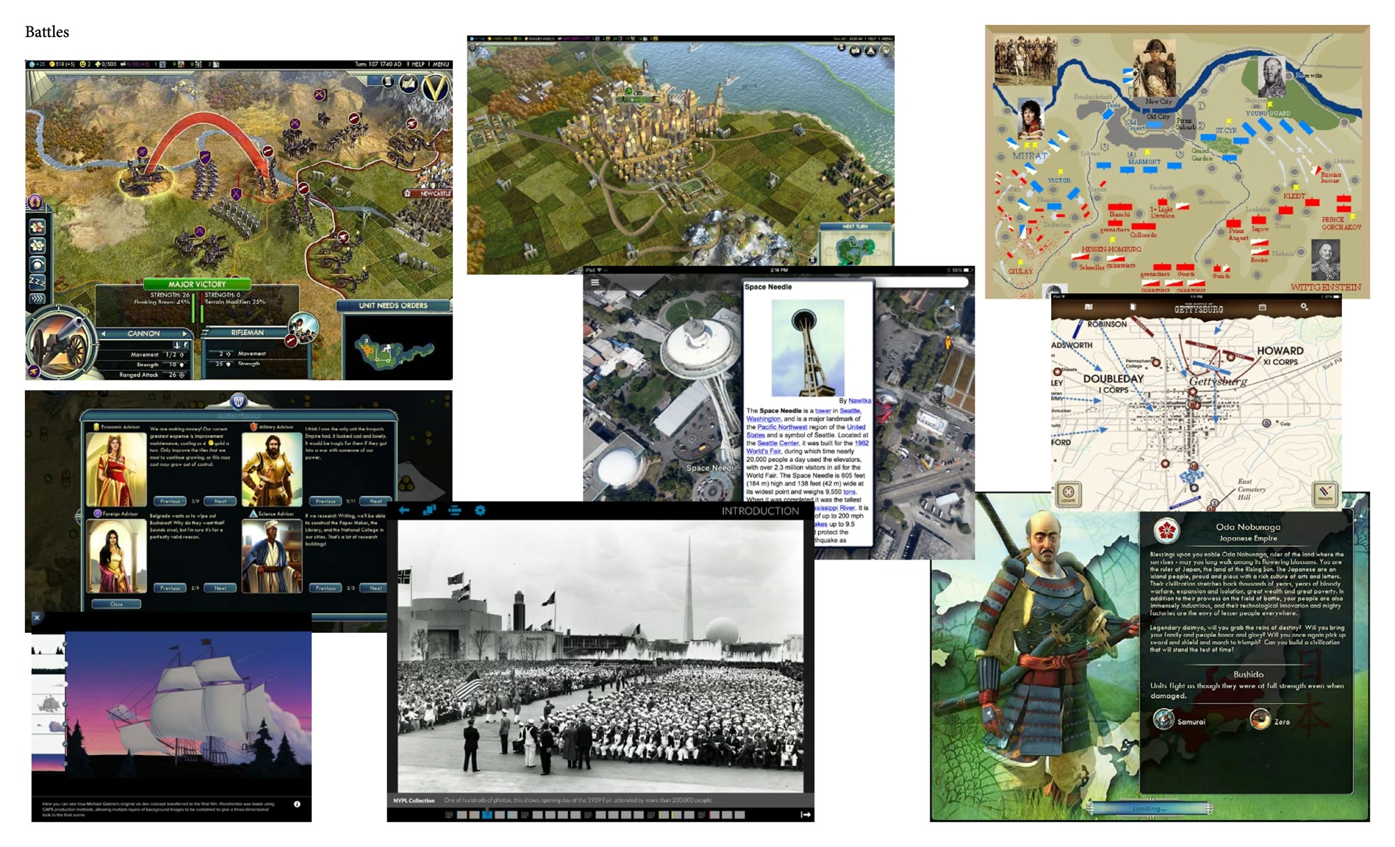
What if we mapped the show's battles the way historians map real wars?
- An interactive battle map with a timeline of troop movements
- Where key characters were, and what happened there
- Stills from the show at each point in the battle
- Highlights of each battle
History
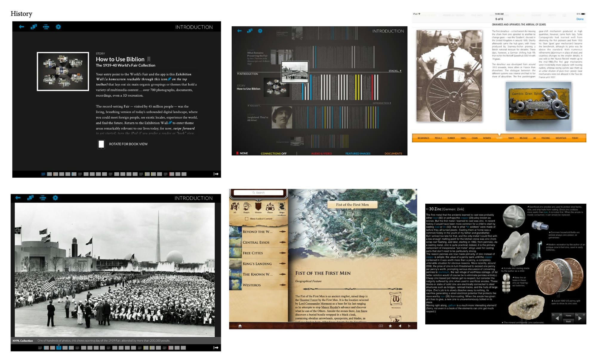
The show only touches the surface of the history the books cover. The app could fill those gaps in the episodes that reference it, drawing on the A Song of Ice and Fire wiki.
- History notes along the episode timeline
- Robert's Rebellion, which sets up the show
- The Azor Ahai prophecy and why it matters
- Pentos and the lands beyond Westeros
Art reference
The show feels both historical and fantastical because each region draws on real cultures. I wanted the app's look to change with the house or region you visit, so I researched each one: manuscripts, ornament and pattern, stone and wood, and architecture.
- Celtic
- Roman
- Moroccan
- Persian
- Gothic and Viking
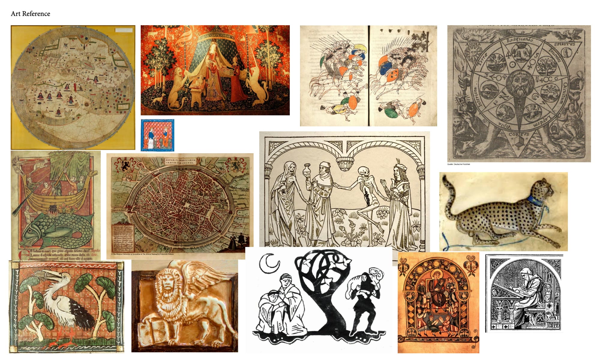
Exhibit explorations
The exhibit was the heart of the app: how we'd display the objects, what the UI would look like, and how everything would interact. I built the foundation for what we could do while the rest of the team tested the best way to show the objects on an iPad.
Exhibit research
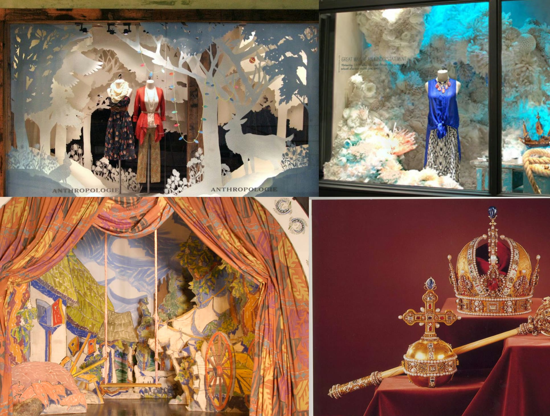
Beyond the traveling exhibition and museums, I looked at non-traditional ways to stage the exhibits. I wanted a sense of being in the place without taking away from the objects, so I looked to high-end storefront windows and the theatre.
Sketchbook
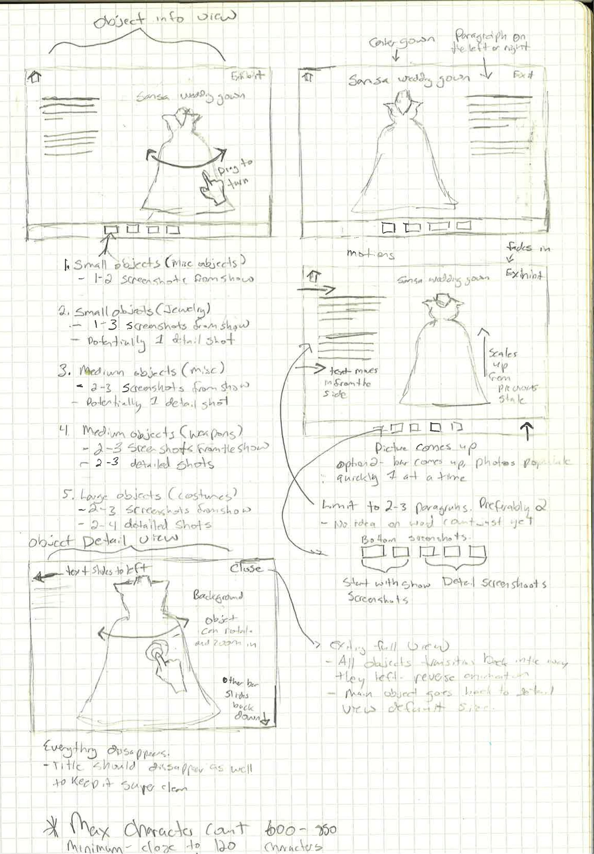
Page after page of sketches on how each object would display: how many show screenshots and detail shots each kind of object gets, how text slides in beside it, and a detail view where you turn and zoom the piece itself.
Chapter flows
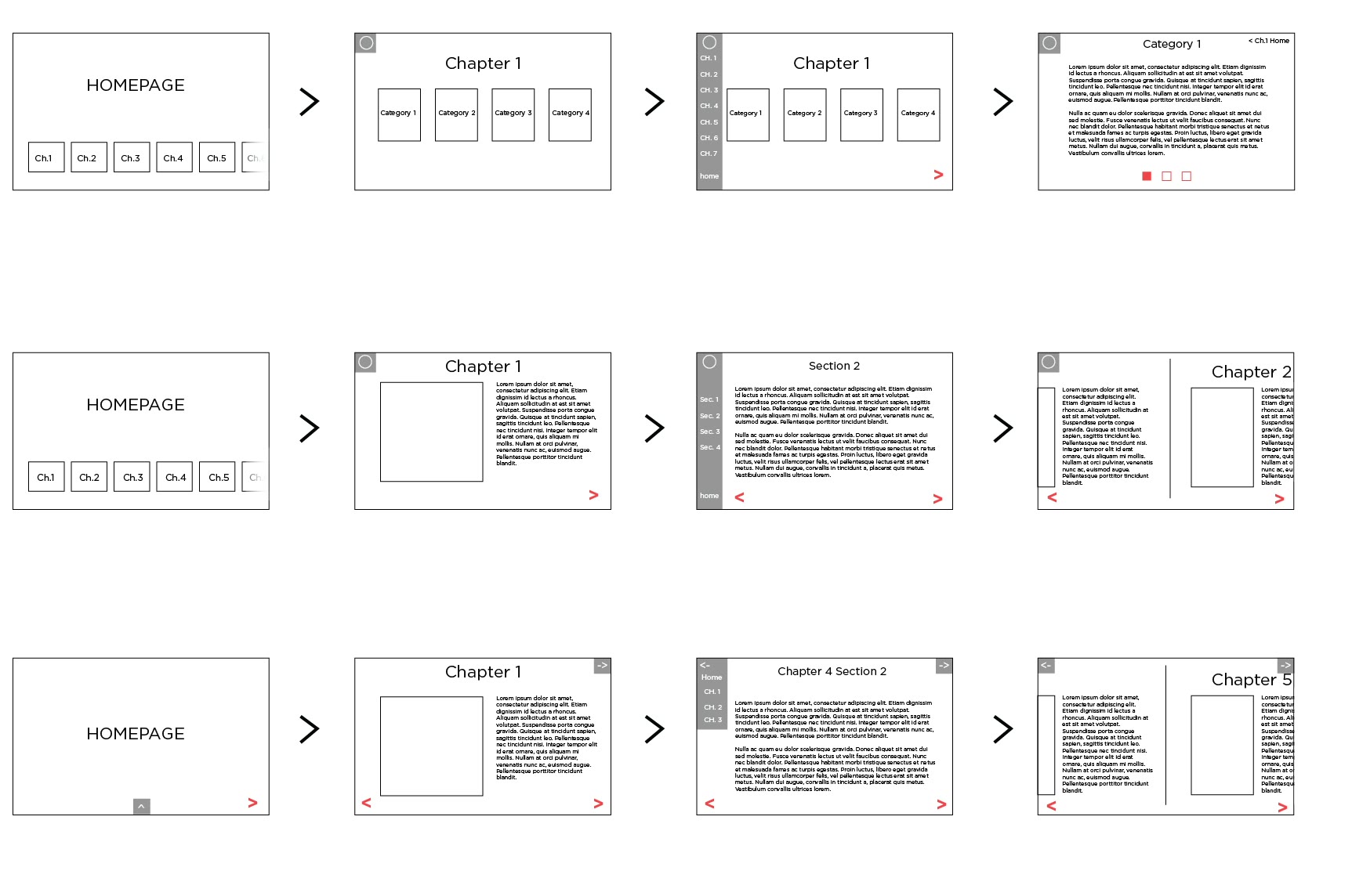
I started illustrating, in very simple terms, how we could lay out the exhibits as chapters: my parameters, the kinds of motion, and the first principles and guidelines.
Storyboard
Walking through an exhibit screen by screen: entering a house, choosing a category, and moving between its props and costumes.
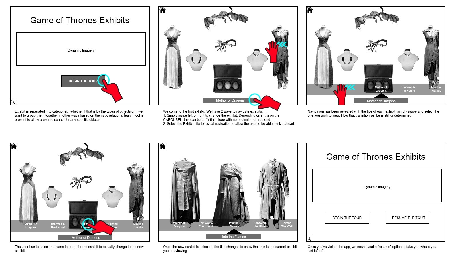
Navigation
How you'd move between a house's costumes, weapons and jewelry: buttons on the walls that lead to the next section, or a navigation that hides until you need it.
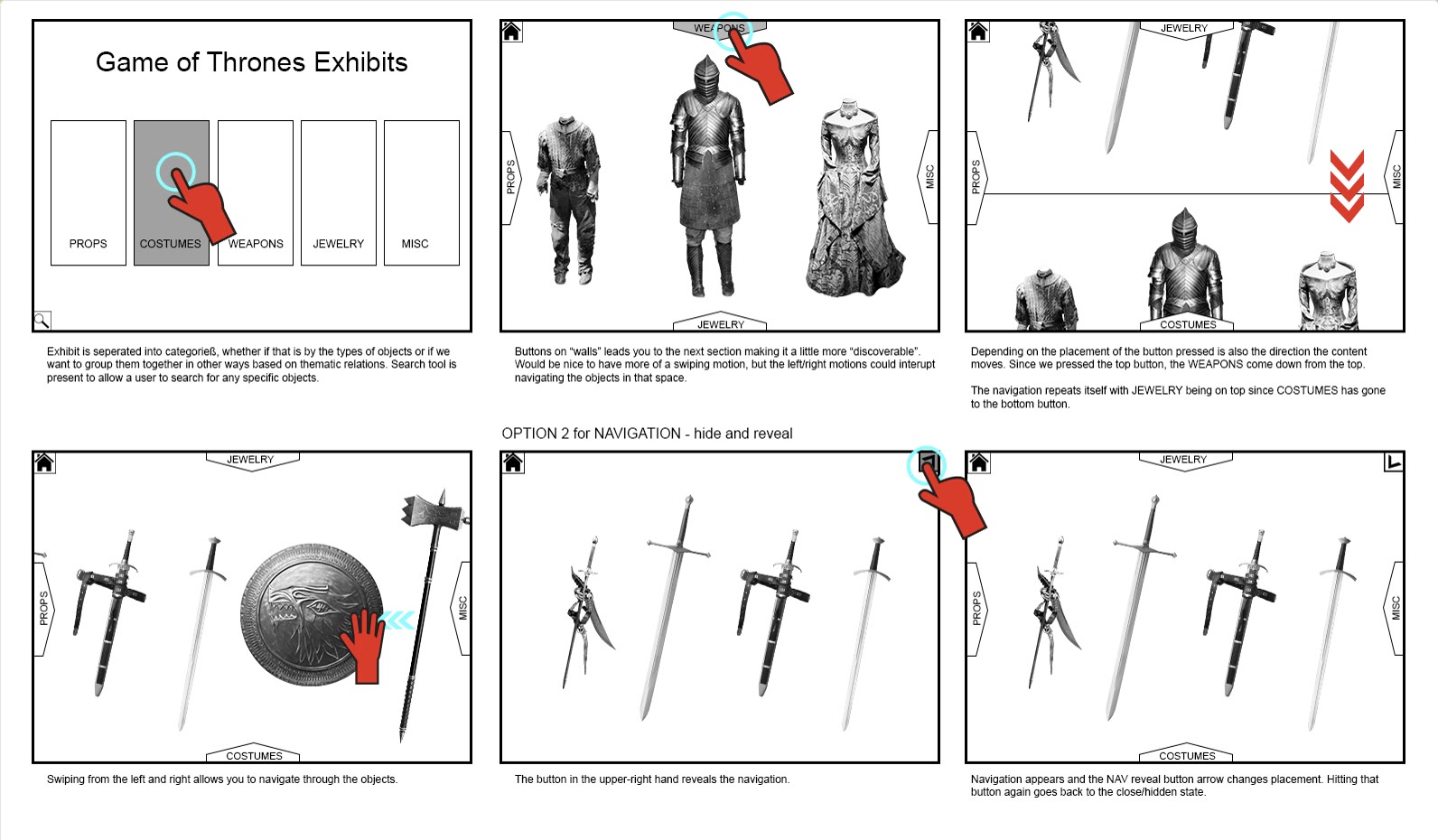
Two frameworks
As the team built out the app's code and structure, I started figuring out the motion and interaction models across two frameworks: how the elements would be laid out, how information would display, which touch gestures we'd use, and how you'd interact with each object.
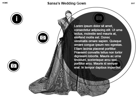
Object detail exploration: icons that float around the piece and open into circles
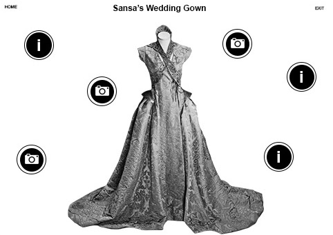
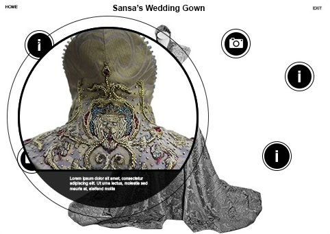
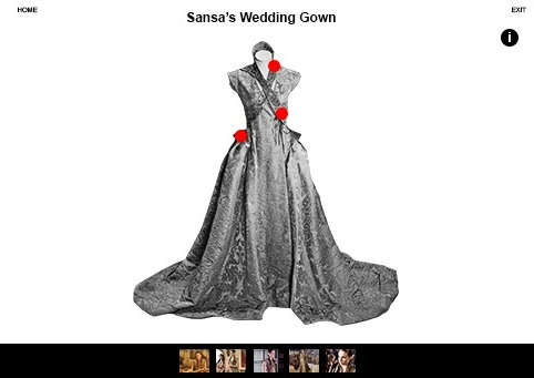
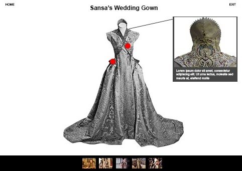
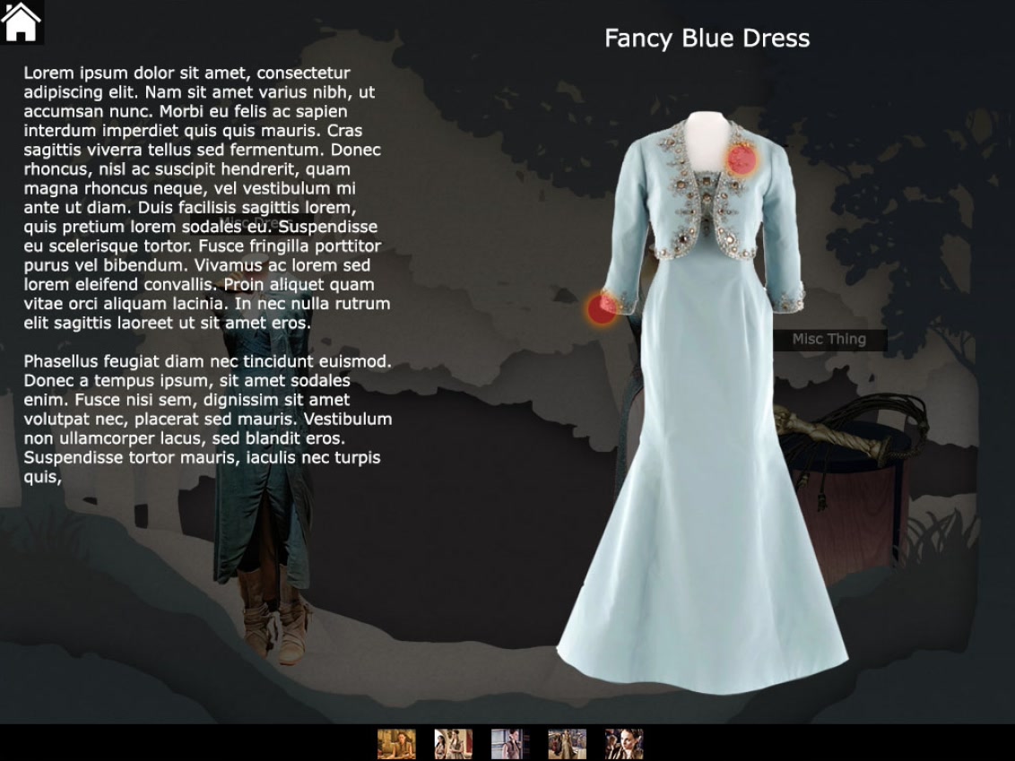
Object detail exploration: hotspots, detail shots, and the piece in its scene
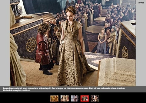
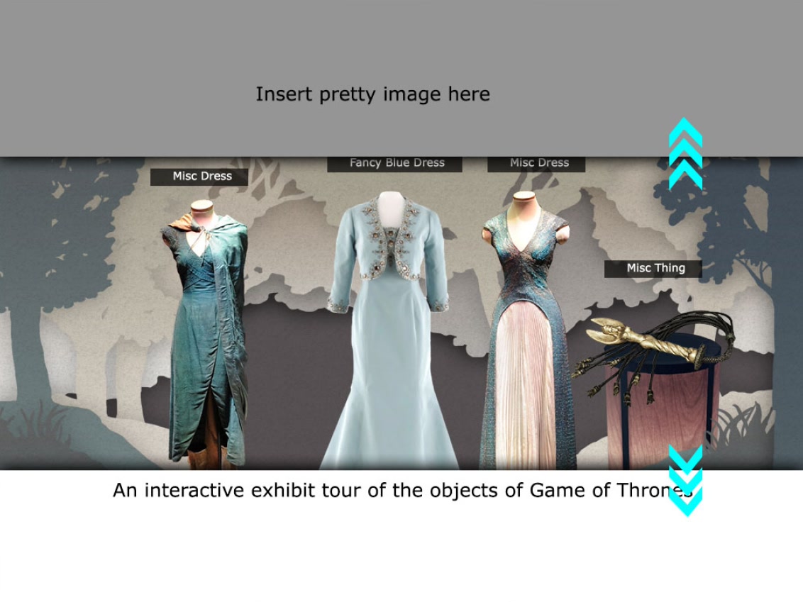
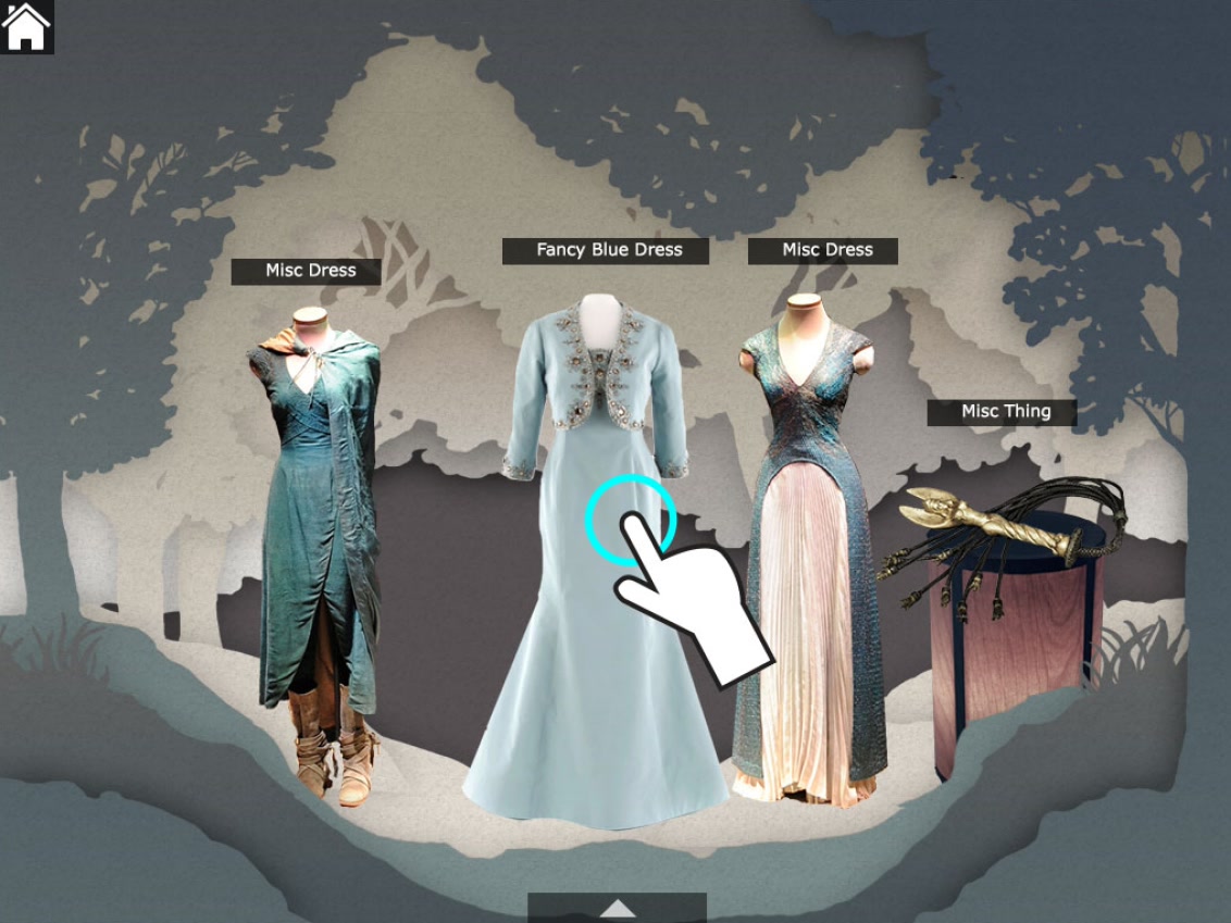
Framework two, rough interaction: entering a scene, choosing a piece, examining it
Outcome
The project was never greenlit. My contract was cut short when funding ran out, and HBO's executives chose not to take it further. Alongside it, we had been developing a VR experience for the first season of True Detective; after I left, that pitch turned the team toward VR, and they went on to build the Westworld VR experience.